
My Role:
Product Design
Year:
2026
Domain:
MSME
Time to read:
10 minutes
/ About
n. 01

What is the OPERI App?
OPERI (Operational Excellence Readiness Index) is a self-assessment app that helps micro and small manufacturers understand their operational maturity, identify priority areas, and improve through a transformation roadmap. Official OPERI information describes a framework with three building blocks, six pillars, and 18 dimensions, with eight KPIs measured in each assessment. The app also supports offline self-assessment.
/ CHALLENGE
n. 02
The problem wasn't only visual.
The product contains significant operational complexity. My challenge was not to remove that complexity, but to make the user's experience of it simpler and easier to navigate. The existing experience had several usability issues that became visible through stakeholder review and direct user validation.

Interaction friction
Some buttons and controls were visually small, making important actions harder to identify and interact with.


Previous Visuals and Flow


/ USER PERSONAS
n. 03
User Personas
The Owner-Operator (Micro & Small Business)
This user is focused on the day-to-day
technical efficiency of a facility.
Assessors/Consultant

/ RESEARCH APPROACH
n. 04

Understand before designing.
I conducted a competitive analysis of two to three key players, focusing on assessment completion time, onboarding flows, pricing structures, and consultant or assessor models. The JTBD analysis identified four situations in which people need the OPERI App: completing assessments efficiently, improving business performance, accessing expert guidance, and overcoming complex processes. I used focused stakeholder reviews and direct user validation rather than assuming a visual redesign would solve the problem.


Solutions by Deny:
Provides an affordable platform that replaces costly consultants with automated diagnostics to uncover business blindspots. It simplifies complex frameworks into jargon-free, bite-sized videos and workflows. By following this roadmap, small businesses fix operational weaknesses and earn a Star Emblem, giving owners peace of mind and a credible benchmark to prove resilience to partners.
/ App STRUCTURE
n. 05

App Structure
This map outlines the complete app structure for both new and registered users. It details the entire user flow—from Onboarding, Quizzes, and the Homepage, to taking the Assessment and receiving the final report.
Users can choose between a self-assessment or a guided session with a professional Assessor. The fixed price of €32 is clearly displayed upfront. The assessment itself takes only 5 to 15 minutes due to its straightforward, intuitive design.


/ USER JOURNEY MAP
n. 06

User Journey Map
User feedback revealed a need for immediate clarity and flexible support. Users with complex concerns needed distinct self-guided and guided assessment paths, while pricing transparency called for clear €32 pricing upfront. A simplified 15-minute process and clear report summary helped reduce stress.
Onboarding
Reduce steps to essential inputs
Allow social login with Google
Highlight data privacy controls
User Action
User thoughts and questions
Gains
Pains
Reduce steps to essential input or allow social login (Google)
Quiz
Short, non-intrusive questions
Clear progression indicator
Add encouraging tips
Complete the quiz
What is this quiz for?
Easy setup
Confusion about the quiz’s purpose
Users with complex concerns need clearer progress indicators and guidance.
Choosing Assessment type
Offer self-assessment and assessor-guided options
Clearly display the €32 price
State the total time: 5–15 minutes
Select flow
Should I complete it alone or get guided help?
Finding the right support
Uncertainty about which assessment to take
Offer self-assessment and assessor-guided options
Assessment Session
Provide distinct interfaces for self-guided questions and live sessions
Keep steps clear and minimal
Offer emotional-health support tips
Participate
Are these questions easy to understand?
Feeling heard and guided
Stress about the process
Reduce steps to essential input or allow social login (Google)
Payment
Secure payment badges (Visa, PayPal)
Simple, transparent one-time €32 payment
Offer a downloadable receipt
Pay
What is this charge for?
Transparent Cost
Feeling overwhelmed by information
Offer a simple, transparent one-time €32 payment with a downloadable receipt.
Get Report
Immediate delivery of simplified report
Personalized recommendations with distinct icons
Offer easy booking for a professional follow-up
Review the report
What does this score mean?
Access to personalized insights
Worrying about what to do next
Offer personalized insights and easy booking for a professional follow-up.
/ WIREFRAME & HIGH FIDELITY
n. 07

Wireframe and High Fidelity
Comprehensive prototype map covering more than 100 screens, including page flows, section paths, and interactive pop-ups.


/ Key Screen
n. 08

Key Screen
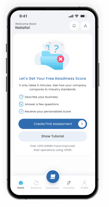
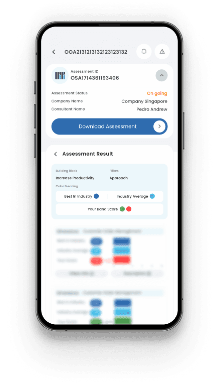
Each screen was designed to help MSMEs achieve their goals efficiently—reducing time, lowering costs, and delivering actionable reports.







/ Validations
n. 09

Validation
Unmoderated remote test across 3 core tasks and a 5
second first impression test.
90%
Task completion
rate
5/5
Ease-of-use rating,
on a 1 to 5 scale
5-10 min
4.5/5
Positive review from project lead
5,000+ downloads
Positive review from CTO


What We Found
Users felt lost on some pages because they lacked tutorials or guidance. Small text was difficult for older users to read. The onboarding flow was too long, which made users tired of entering company details.
What Changed
We added tutorial guidance to the top bar so users can access help whenever they need it. We increased font sizes and refined layouts to improve readability. We also simplified the flow and removed unnecessary information from company details.
/ Design System
n. 10

Design System
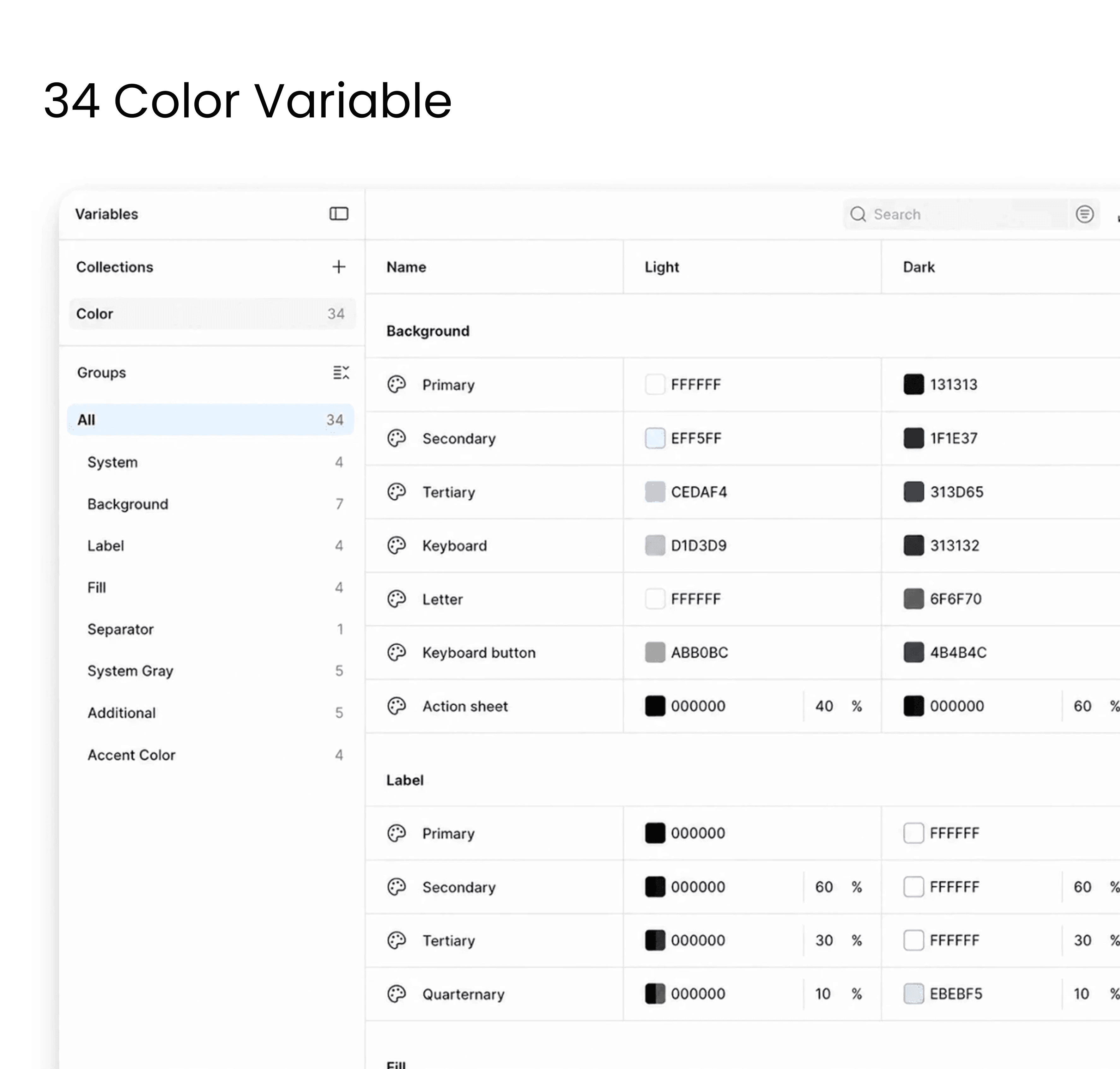
Grow required a complete design system with 34 semantically defined color variables. The component library includes more than 130 elements built on that variable system. Poppins was used throughout, keeping the experience native and familiar across Google Play and iOS.

Key Takeaways
What I Learned
Actionable experience. By combining clear visual tracking with access to expert Assessor guidance, the interface successfully bridges the gap between complex assessment metrics and real-world business growth without overwhelming the user.
What I'd Do Differently
In future iterations, I would place a stronger visual emphasis on direct impact metrics—such as immediate cost and time savings—right on the main dashboard, while further optimizing mobile data views to ensure heavy reporting remains perfectly scannable and accessible on the go.
